ICON CHANGES - DO WE NEED AN OFF BUTTON FOR HOVERED TEXT?

Moderators: Ane M, joli3ma3, lisa, tx2001aggie, Jeanetta

User avatar
David J Weston
Posts: 110
Joined: Fri Jan 09, 2015 11:25 pm

ICON CHANGES - DO WE NEED AN OFF BUTTON FOR HOVERED TEXT?

Postby David J Weston » Fri Jul 31, 2015 9:44 pm

As part of the preparation for the feeding game, I requested a button for the feeding game, and our artists responded by creating a complete set of co-ordinated buttons for the right side of the slide. I also took the opportunity to re-organise the way the buttons work, and Al provided software enabling us to radically change the way the hovered text is delivered. This article is to advise about the changes, but I also want to hear whether the users think better positioning of the hovered text removes the need for an 'off' button, which though possible is far more work than it sounds like. I will be glad to provide one if necessary, but if better positioning removes the need, I have plenty of other things I can spend my time on.


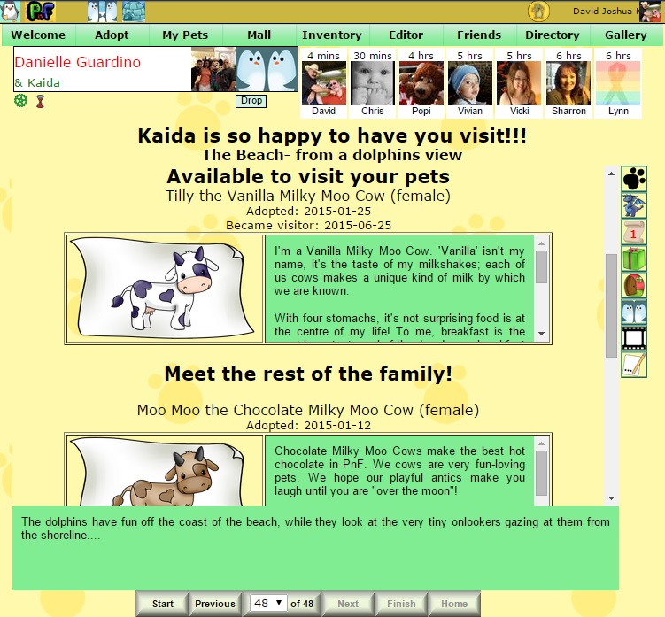
First, how another user's page looks (thanks Danni!) The 'visitor', 'greeter' and 'other pets' icons have been reduced to ONE, and the look of all the icons has been unified.
Image


The 'greeter' page now introduces the visitor as well ---

Image


--- and the 'greeter'page also introduces any other pets the page owner may have.
Image


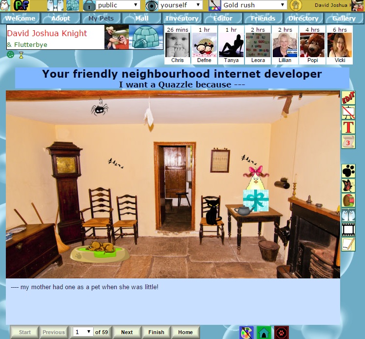
On your own page,the 'edit' button looks very different, but the main thing is the 'post to gallery' button is now an easel. We hope this will make it easier for new users to guess what it is for.

Image


Here is the 'cannot post to gallery' version of the button.
Image


If there are any badly placed uses of hovered text elsewhere in the app, please let me know. If after moving them the hovered text is still seen as necessary to switch off, I will then consider fitting the creation of an 'off' button into my schedule.

User avatar
vey_chyryn
Posts: 2140
Joined: Mon May 25, 2015 3:44 am
Location: Kentucky, USA
Contact:

Re: ICON CHANGES - DO WE NEED AN OFF BUTTON FOR HOVERED TEXT?

Postby vey_chyryn » Sat Aug 01, 2015 12:11 am

The change is a big help. I can deal with the text as it is now, on a user's page.

I still have issues with text overlapping on the buy silver page, the buy cards page, and the two large PnF and MSP banners that pop up on any page when you run over the icon. The last one for me only goes away if I run my cursor over another item with a hovered text or click multiple times on text on the page.


While I don't like the hover text being constant, if the other pages can be coded so the text hovers to the side as well, I can learn to deal with it.


EDIT: I am also having issues with the text overlapping on the food and drink pic pages where if I run over the buy image I can no longer get to the box to edit the number to purchase

User avatar
David J Weston
Posts: 110
Joined: Fri Jan 09, 2015 11:25 pm

Re: ICON CHANGES - DO WE NEED AN OFF BUTTON FOR HOVERED TEXT?

Postby David J Weston » Sat Aug 01, 2015 1:43 am

If you send me an IM on Facebook with a complete list of places to make changes, I could well have the job done next week. We now have a system that allows for all the options we could ever want.

User avatar
vey_chyryn
Posts: 2140
Joined: Mon May 25, 2015 3:44 am
Location: Kentucky, USA
Contact:

Re: ICON CHANGES - DO WE NEED AN OFF BUTTON FOR HOVERED TEXT?

Postby vey_chyryn » Sat Aug 01, 2015 6:22 am

Will do!

User avatar
lynnmccorry
Posts: 241
Joined: Sat May 23, 2015 11:40 am
Location: Perth, Western Australia

Re: ICON CHANGES - DO WE NEED AN OFF BUTTON FOR HOVERED TEXT?

Postby lynnmccorry » Sat Aug 01, 2015 3:23 pm

Strangely, I only noticed this today. When I go to the department store and try and buy things, the hovered text over the dollar sign (where it shows you how many items of each you can afford to buy) keeps going over the place where you would put in the amount of things you want to buy. It doesn't just disappear without you having to move your cursor around a bit. Then when I go back to put in a number, sometimes the same text pops up again I've never noticed that this was a problem before. It could be because I was buying quite a few of the new items all at the same time and I did find it a little annoying as I had to keep moving my cursor around so I could input a number of items to buy.

It would be great if the hovered text could show up above or below the boxes so you can just move your cursor across and input the amt. you want to buy without having to move it all around the page to get it off.

Of course I can live with it but if it's something that could be easily fixed, that would be great. I'm fine with the text hovering in other places. A turn off switch would be nice but not if it takes heaps of work.

Thanks x x x Lynn
Lynn and Lily
Come and visit us anytime, we love visitors.
https://apps.facebook.com/petsnfriends/ ... 3298643194

User avatar
Tear E Hatchet
Posts: 121
Joined: Sat May 23, 2015 8:27 pm

Re: ICON CHANGES - DO WE NEED AN OFF BUTTON FOR HOVERED TEXT?

Postby Tear E Hatchet » Mon Aug 03, 2015 9:56 pm

With the hovered text to the side I think getting an off-switch is a little less urgent :-) but it would still be a nice addition somewhere down the line.
I have some issues with the alignment of the text box in Firefox though (Chrome seems much better), where it overlaps quite a bit of the icon on the My Pets and other users pages:

Image

Image

Image

Thanks for all your work!

User avatar
joli3ma3
Posts: 523
Joined: Sat May 23, 2015 4:23 am
Location: Ontario, Canada
Contact:

Re: ICON CHANGES - DO WE NEED AN OFF BUTTON FOR HOVERED TEXT?

Postby joli3ma3 » Tue Aug 04, 2015 12:59 am

I would like to be able to turn off the hovered text at some point. I can see how it's very useful for new users but once you know what you're doing it's just in the way.

I don't feel any urgency though, it's a mild nuisance. If you ever get around to an off switch, great. If not, that's fine too.

Thank you for your continued hard work!

User avatar
BenteG
Posts: 67
Joined: Sat May 23, 2015 1:48 pm

Re: ICON CHANGES - DO WE NEED AN OFF BUTTON FOR HOVERED TEXT?

Postby BenteG » Tue Aug 04, 2015 3:45 am

Yes, we definitely need an off button for hovered text! :-D

User avatar
Aquarius
Posts: 696
Joined: Sat May 23, 2015 12:07 pm

Re: ICON CHANGES - DO WE NEED AN OFF BUTTON FOR HOVERED TEXT?

Postby Aquarius » Tue Aug 04, 2015 3:39 pm

Bente wrote:Yes, we definitely need an off button for hovered text! :-D


I fully agree with Bente! I really struggle with this, as I need to shake paws on my iphone to continue to participate in the game on a regular basis, because I can do it while commuting and when I don't have wifi computer access overseas. Unfortunately, using my iphone as a hotspot just to play the game on a computer costs me too much for data :(
Warm hugs from Kris & Aquarius

Image

User avatar
jannbb
Posts: 108
Joined: Sat May 23, 2015 4:48 am

Re: ICON CHANGES - DO WE NEED AN OFF BUTTON FOR HOVERED TEXT?

Postby jannbb » Tue Aug 04, 2015 4:07 pm

Jann https://apps.facebook.com/petsnfriends/ ... 7109872890

If we are taking a vote about the hovered texts and an off button for them, I vote yes for the off button. I find them very annoying and distracting. New users however, may find them helpful, so an off button would be great.

Thanks so much.


Return to “New features”

Who is online

Users browsing this forum: No registered users and 1 guest