ICON CHANGES - DO WE NEED AN OFF BUTTON FOR HOVERED TEXT?
Posted: Fri Jul 31, 2015 9:44 pm
As part of the preparation for the feeding game, I requested a button for the feeding game, and our artists responded by creating a complete set of co-ordinated buttons for the right side of the slide. I also took the opportunity to re-organise the way the buttons work, and Al provided software enabling us to radically change the way the hovered text is delivered. This article is to advise about the changes, but I also want to hear whether the users think better positioning of the hovered text removes the need for an 'off' button, which though possible is far more work than it sounds like. I will be glad to provide one if necessary, but if better positioning removes the need, I have plenty of other things I can spend my time on.
First, how another user's page looks (thanks Danni!) The 'visitor', 'greeter' and 'other pets' icons have been reduced to ONE, and the look of all the icons has been unified.
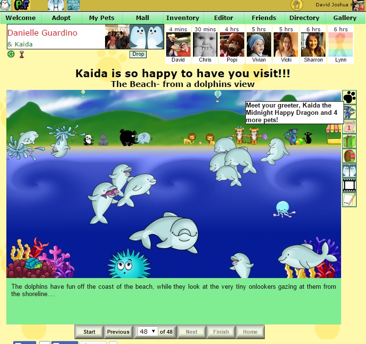
The 'greeter' page now introduces the visitor as well ---

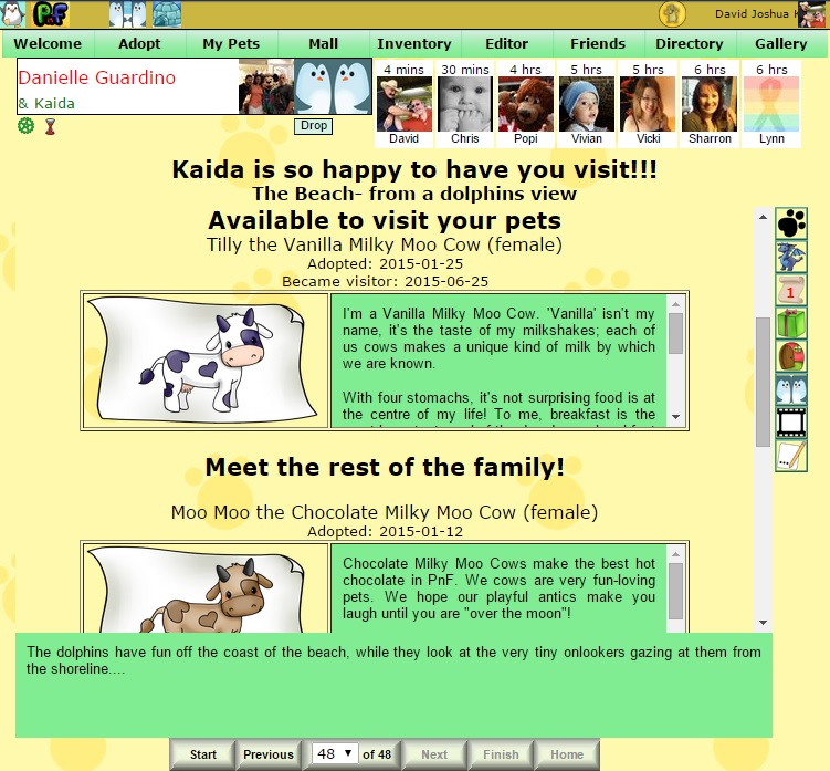
--- and the 'greeter'page also introduces any other pets the page owner may have.
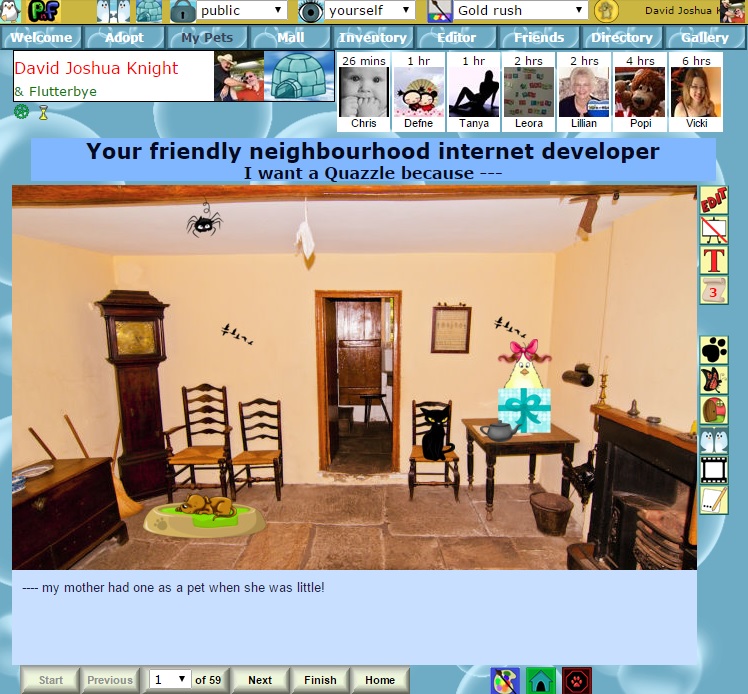
On your own page,the 'edit' button looks very different, but the main thing is the 'post to gallery' button is now an easel. We hope this will make it easier for new users to guess what it is for.

Here is the 'cannot post to gallery' version of the button.
If there are any badly placed uses of hovered text elsewhere in the app, please let me know. If after moving them the hovered text is still seen as necessary to switch off, I will then consider fitting the creation of an 'off' button into my schedule.
First, how another user's page looks (thanks Danni!) The 'visitor', 'greeter' and 'other pets' icons have been reduced to ONE, and the look of all the icons has been unified.
The 'greeter' page now introduces the visitor as well ---

--- and the 'greeter'page also introduces any other pets the page owner may have.

On your own page,the 'edit' button looks very different, but the main thing is the 'post to gallery' button is now an easel. We hope this will make it easier for new users to guess what it is for.

Here is the 'cannot post to gallery' version of the button.

If there are any badly placed uses of hovered text elsewhere in the app, please let me know. If after moving them the hovered text is still seen as necessary to switch off, I will then consider fitting the creation of an 'off' button into my schedule.


